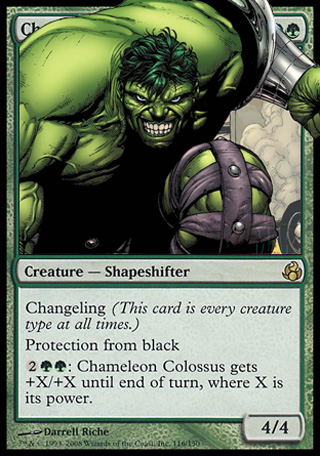
Intimidating Hulk:

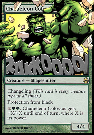
Raging Hulk:

original picture
So, first time I looked at the Chameleon Colossus original art, I saw something pretty huge (colossal :D) and green!... come on, it came to my mind in about 2,79 seconds... nothing better than HULK to feature something green and colossal :), and it also shapeshifts!! (Bruce Banner - Hulk). Just another of those 'fits perfectly' concepts.
But which one do you prefer? I like the first one because of the intimidating and powerful stance, covering the whole space because of his colossal size; but I also like the second one because of the destructive and raging feeling.
Please vote!
Original Chameleon Colossus Artist: Darrell Riche
Original Intimitating Hulk Illustration Artist: Marvel
Original Raging Hulk Illustration Artist: Marvel
2 comments:
I'd like the "intimidating" version but i think that it will look better if you scale down the picture a little.
Es decir, el encuadre no me acaba de convecer del todo, quizas se sale demasiado del marco.
Thanks for your comment!
My main idea about that concept was to show the "new" Chameleon Colossus as something huge, so making Hulk so big to cover so much space was completely intentional :).
I think reducing his size will make him lose a bit of his impetus.
Thanks!
Post a Comment